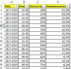
You get an little triangular icon at the edges of those cells, which will allow you to sort the columns. Please sort the table on service level. You should get the result presented on the left.
Please note that for this example we use just a few data points. To get best results you should at least use 250 data points or so to get a good sample. Again, more is better.
Now, select the cells (including the headers) of the columns with the service levels and abandonment rates. Click on the scatter plot icon that looks like this: ![]()
And there she appears, the scatter plot chart. In this example our scatter plot looks like the image on the left.
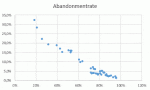
This graph now shows you the abandonment rate you had in the past, with the according service level. In this example the trend is obvious, around 80% service level, we had an abandonment around 5%. Sure, this graph alone tells you very little about the waiting time; the time customers waited before they hung up the phone.
For our example we add the wait-time before abandonment and made a new scatterplot with the wait time on the horizontal axis. This is how it looks like.
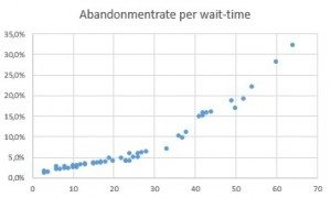
Now you see, that you reach the 5% abandonment rate around the 20 seconds. This will give you some feeling what an appropriate service level could be. For instance, if the 80% target in the sample above matches a service level of 80% / 10 seconds, you now could have an argument to try something different.
I would always advise people to choose a high percentage; with the sample above, perhaps a service level target of 90% in 30 seconds could do the trick to keep your abandonment below 5%. Give it a try, staff for different service level parameters for several weeks. Do not make massive adjustments, but tweak with the seconds and percentages a bit. On large scale this will help you reduce waste and staff more efficiently. Another reason to keep your percentage up high is the service level interval score.
The average service level on our example is 72% over 49 intervals. Sounds pretty ok right? However, from those 49 intervals, there were 13 intervals that were 10 percent lower than the average. So: In this time periode (it happens to be 1 day with an opening window of 8.00h – 20.15h) we have more than 26% (13 divided by 49) of our intervals that we score more than 10 percent lower than our average score. In some companies you see a KPI called “Service Level Interval Score” or SLI-score. It measures the amount of intervals you scores within a bandwidth of your target service level. For instance, if in our example the target service level would have been 70%; the average of 72% would made people applaud. However, with a measured SLI of 52% (24 intervals had a deviation of more than 10% than the target, in other words; you had 24 intervals that were either lower than 60%, or higher than 80%) the result is just devastating in the eyes of the many.
Our conclusion is that each contact center should at least make the above analysis and run some simulations on different service level goals. Also, by setting your goal; choose a high percentage to minimize the amount of intervals you drop below your bandwidth. A good service level target should at least be accompanied by a service level interval score to measure not only your daily average, but also show the continuity of your service. Good luck!
Spril is a leading Dutch company in Workforce management. Whether it is customer contact, healthcare or government; we are there. Our enthusiastic team of WFM professionals is available to help you excel in this profession. We do this with training, consultancy, analysis and interim solutions. In the Netherlands, Belgium and abroad.
